
A dish can be beautiful in person and still feel flat, cluttered, or unremarkable in a photograph. When that happens, start with three questions: What is the light doing? Where should the viewer look? And does this angle show what makes the dish appealing?
These questions give you a practical way to improve a photograph without changing everything at once. They also give content creation teams a shared language for reviewing their work.

1. Choosing the background before checking the light
A textured wall or beautifully set table can be tempting. But if you choose the scene before looking at the light, you may find yourself struggling with distracting shadows, bright reflections, or a mix of daylight and overhead lighting.
Try this: Start with the plate near a window and study the food itself. Move around it. Look for the position where the light reveals texture and gives the dish shape. Then build the rest of the scene around that position.
If the overhead lights are affecting the color, turn them off when possible and permitted. If the scene is too contrasty, test a white card on the shadow side. Change one thing at a time so you can see what actually helps.
For an agency team, a quick location check before the shoot can help you identify a suitable working area before the dishes arrive.
2. Giving every prop equal importance
A linen napkin, a glass, a handful of ingredients, and a beautiful plate can each add something. Together, they may compete for attention.
Styling becomes easier when you decide what the photograph is about. Is it the glossy surface of a dessert? The freshness of a salad? The feeling of sharing a meal?
Try this: Take one photograph, then remove a supporting object and take another. Repeat until the main subject feels clear. You can always bring an object back if it contributes to the story.
Look at the edges of the frame as well. A bright fork or a partially cropped glass can draw attention away from the food. Consider the final use: an image for a website banner may need open space for text, while a closer social crop may need a simpler arrangement.
For teams creating several formats, agree on those uses before styling. It is easier to leave room intentionally than to discover later that every composition is too tight.
3. Using the same camera angle for every dish
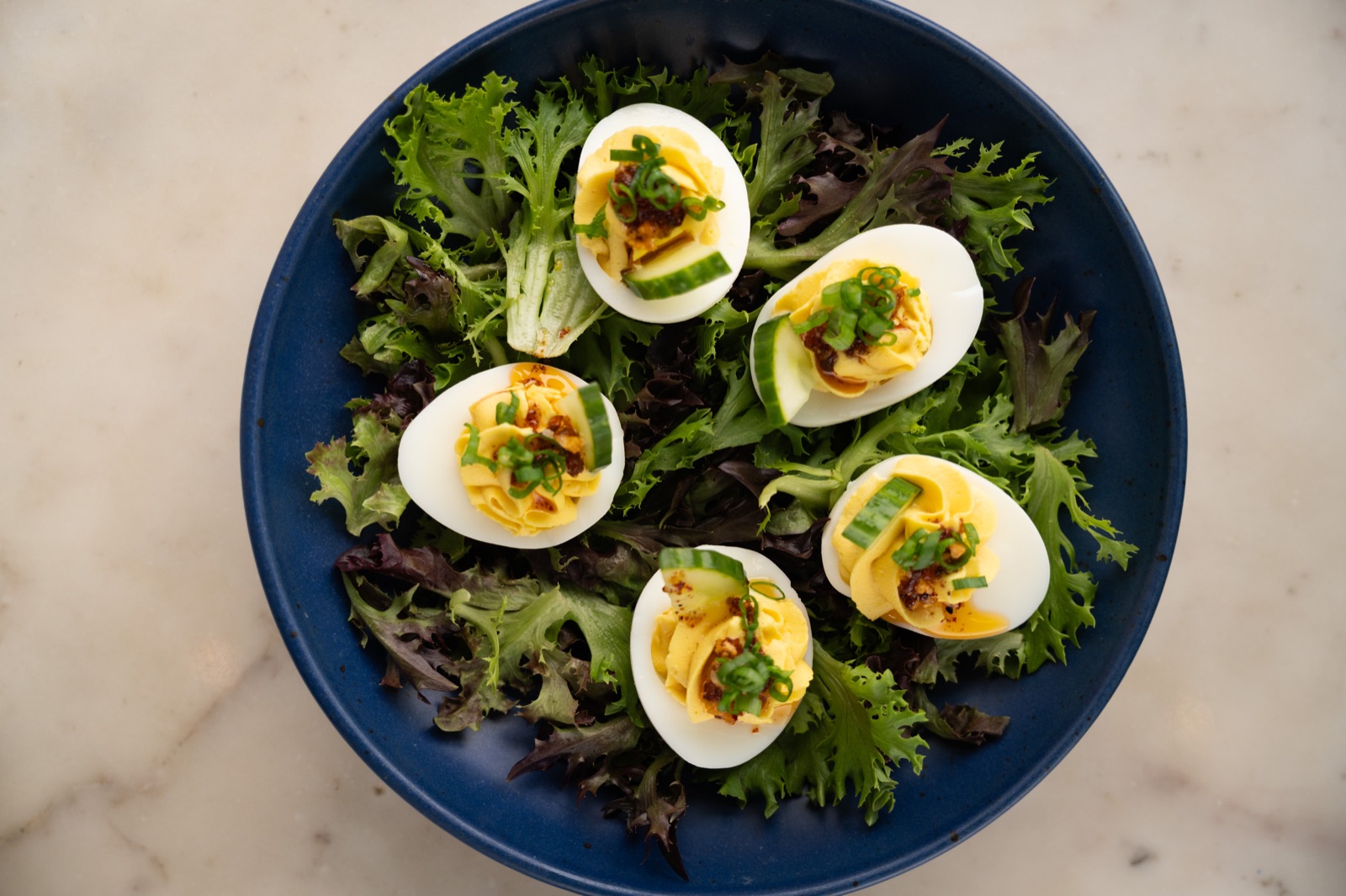
An overhead view can show a table arrangement beautifully, but it may hide the layers of a sandwich. A lower angle can reveal height while concealing details on a flat plate.
Try this: Photograph the dish from overhead, at roughly 45 degrees, and from a lower position. Compare what each view reveals and what it hides.
Choose the angle that makes the defining feature clear. Then inspect the background, plate edges, and focus. An appealing angle still needs a carefully composed frame.

Make feedback more specific
Instead of saying, “This image needs something,” try naming the issue: “The glass is brighter than the dish,” or “This angle hides the filling.” Specific observations make your next adjustment easier.
Hands-on guidance was also part of my private Savor the Light workshop with the team at Segal Communications, where participants practiced food photography together.
That is valuable for individual photographers and for companies whose creators need to discuss images together. A shared way of looking can make feedback more useful without asking everyone to have an identical style.
For a look at an earlier gathering, read about Savor the Light at Bouche in San Francisco. Explore Savor the Light food photography workshops to learn more about the experience.
Savor the Light brings observation and hands-on practice together. If you would like to hear about the next workshop—or discuss photography education for your creative team—send me a note.
For a closer look at the learning experience, explore Inside Savor the Light: a workshop for creatives and content teams.


Share to
BOOK NOW